

Revitalizing Third Spaces · Self-initiated UX design challenge
Supper Club
A bring-your-own-meal app that lowers the social and financial cost of showing up to third spaces for Gen Z.
Problem
Third spaces aren't disappearing - so why are people disengaging?
Third spaces are the social places outside home and work, where you can drop in, belong, and run into familiar faces. Many still exist, but since COVID participation has declined: they feel far away, empty, or transactional, with pressure to spend money or justify the outing.
How might we create relaxing and effortless experiences that enable Gen Z to use third spaces actively?
Throughout this case study you'll see bold orange text. These are my footnotes to myself as I went between research and ideation.
Going in, my first questions were how do we define a third space, and why does it need revitalizing?
Third spaces are the social environments outside of home and work. Historically (the Agora, the Imperial Teahouse) they've been central to building community, informal social ties, and emotional well-being. Ray Oldenburg, who coined the term, defines them by their openness, informality, accessibility, and social orientation: you can drop in without an appointment, feel a sense of belonging, and run into familiar faces.
Many third spaces still physically exist, but participation has declined, especially since COVID. Home and work have collapsed into the same space with remote and hybrid work, and many third spaces now feel far away, empty, or transactional: there's an expectation to spend money, invest time, or justify the outing, while social connection increasingly happens online. So the problem is disengagement, not disappearance.
Three themes I explored further
Online activity
Constant digital access creates a “why go out when I have the world at my command?” mindset, yet research shows neural activity and social bonding are heightened in person, so digital substitutes don't replace third spaces.
Accessibility
Car-oriented zoning puts third spaces out of walking distance, gentrification displaces long-standing community spaces, and underfunding hits lower-income neighborhoods hardest.
Economic issues
Cost comes up in about 1/3 of Reddit discussions about the decline of third spaces. Rising costs of living turn casual outings into financial decisions, and chain establishments discourage co-created social culture.
Who uses third spaces, and the Gen Z signal
- Young adults are the biggest users (ages 20–39 in the surveyed sample), and Gen Z uses third spaces hybridly, often to work.
- Across every model, people with lower incomes were significantly less likely to use third spaces, and to use them meaningfully, than people with high incomes.
- Third spaces are having a moment on TikTok and YouTube: 2026 has been called the “year of the third space,” and #thirdspaces is full of people wanting creative spaces organized through social media.
- Gen Z wants a third space. They're just missing that push.
SWOT: two successful third spaces
Salesforce Park (physical space)
Strength: reachable by public transit, supports passive interaction like walking and people-watching. Weakness: a visibly stratified crowd. Opportunity: a mixed-use area that decenters consumption. Threat: could be dominated by Financial District workers and feel formal or exclusionary.
Timothée Chalamet look-alike contest (event)
Strength: high energy, a hybrid of digital and physical, and free. Weakness: a very niche community. Opportunity: using third spaces to bring internet trends into real life. Threat: depends on social platforms to get people there.
I want to continuously define my metrics: time taken for each visitor to get there, and screen time used while visiting.
How might we reduce economic and social pressures to encourage all Gen Z professionals to use third spaces actively?
Solution
Supper Club turns a meal you'd eat anyway into a low-stakes reason to show up.
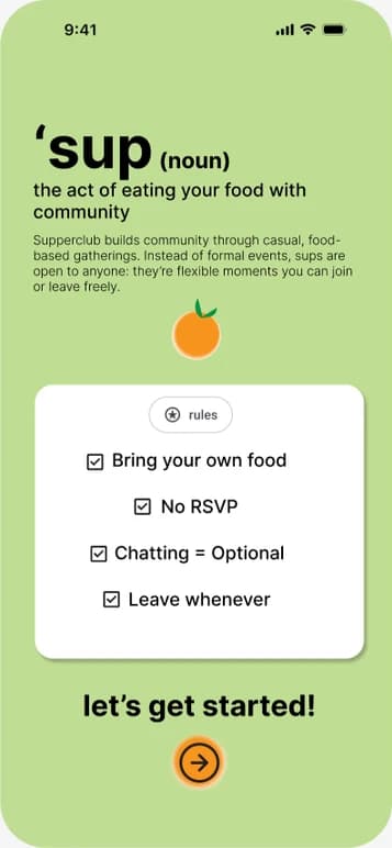
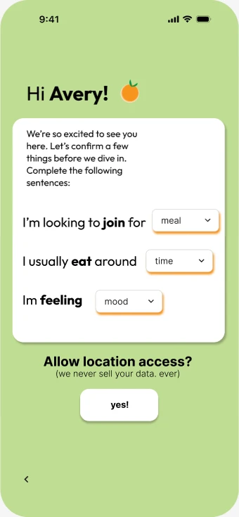
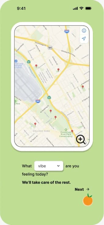
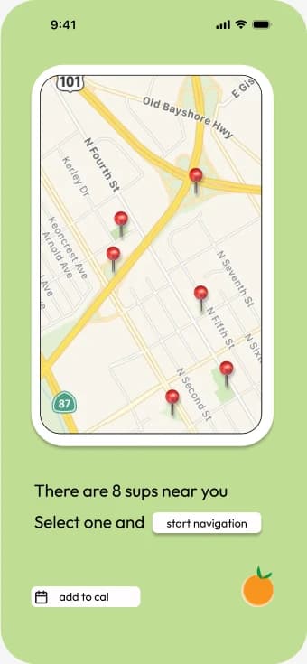
Supper Club is an app that points you to a 'sup near you: a meal where you eat your own food with community. You fill in what meal you're joining for, when you usually eat, and how you're feeling, and the map zooms in on nearby 'sups that fit your vibe, with one tap to start navigation. Four rules set expectations up front: bring your own food, no RSVP, leave whenever, and chatting is optional.

No spending pressure
Bring your own food, so cost, a top deterrent, drops out.
Minimal effort
No planning and no RSVP, with GPS handoff for fatigued users who won't travel far.
Ambient socialization
Chatting is optional: being around people counts.
Measurable comfort
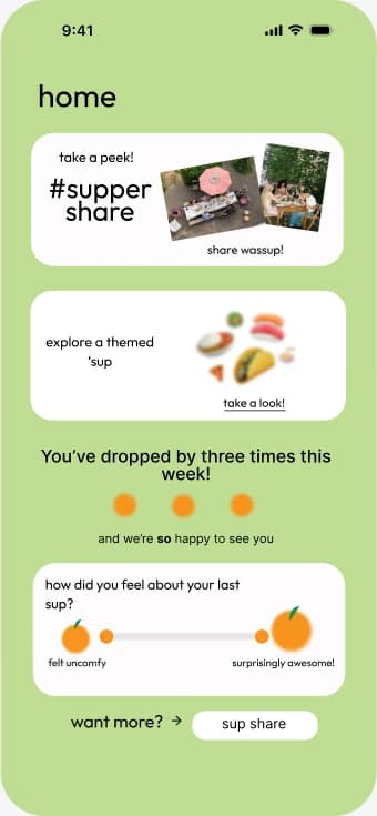
Each visit asks how the last 'sup felt, to track whether the social barrier is actually lower.
Research
The ideal third space isn't exciting. It's relaxing.
I surveyed 51 people ages 18–23 through my Instagram, then ran an informal focus group for depth. I'd assumed people wanted events; most wanted to relax, and fatigue kept more people home than cost did.
- Top place45%Cafe
- Ideal space51%Relaxing
- Top deterrent52%Tired
Survey, n=51, ages 18–23
“It gives me something to look forward to, something to do with my hands, and something to fall back on if conversation is awkward.”
A survey for breadth, a focus group for depth
Survey
I posted a survey to my Instagram, since my audience there is mostly Gen Z. My research hadn't surfaced big demographic differences beyond age, so age was the only demographic I asked for. I focused the final questions on feelings rather than assuming economic pain points, and on where people like to go in general.
- Participants
- 51
- Age range
- 18–23
Where do you go that's not work or school?
What describes your ideal third space?
What makes you not want to go?
Of the 51 participants, 23 prefer cafes and 17 prefer the gym. Cost and fatigue are the main deterrents.
I was surprised by how many people described their ideal third space as relaxing. I'd assumed people wanted events and exciting activities. Is it a bad thing for people to use third spaces on their own if that's what they prefer? Isn't that still community? I decided to focus less on the social aspect and more on active use.
Coming back to this after ideating, I've decided that ambient socialization was a good middle ground. Interesting to see how my opinions changed. Not being extremely social doesn't mean you aren't actively using the space.
Focus group
To get at the social side of the HMW statement, I ran an informal focus group on how people feel about social spaces. I kept questions open-ended to avoid bias and noted key phrases.
Key findings
- Ideal third space: close by, free food and drinks, easy to reach (near transit or a 15–20 minute walk), airy and light, with conversation areas supported by good design.
- Phone vs. friends: time on the phone feels draining. “I feel happy in the moment, but regretful afterwards.” With friends, it doesn't take as much energy.
- What feels welcoming: nonjudgmental, warm and cozy, lots of outlets, not too loud or too quiet, an inviting entrance, and people who feel inviting enough to sit down next to.
Combined insights
- 51% want a relaxing experience, and fatigue drives their aversion to third spaces. People don't want to plan to use one, and long travel isn't worth it, so a third space should ask for minimal input from the user.
- The pull toward cafes and free food suggests food is more than a perk: it's a reason to show up and a social safety net.
- Gym-goers described the gym as a companion activity, usually with 1–2 others. Gen Z values low-stakes socialization: it's enough to be around “people who feel inviting enough to sit down next to.”
I want to continuously define my metrics: logistical ease to get to the location, willingness to go to an event, and positive emotion while attending.
Refined: How might we create relaxing and effortless experiences that enable Gen Z to use third spaces actively?
Insights
Showing up has to cost less: less energy, less money, less pressure.
I clustered my survey and focus-group findings on an affinity map. Three themes came out.
Social interaction
Casual is enough
Gen Z wants togetherness, with people they know or don't, in spaces that feel nonjudgmental.
Energy and fatigue
Restore, don't drain
A third space should give energy back after a long day, not take more.
Cost and logistics
Friction breaks momentum
The pressure to spend and the distance to travel both keep people home.
Three themes from the affinity map
I sorted the survey and focus-group findings into sticky notes and clustered them, supplemented by my earlier research on online activity.
Social interaction
Gen Z wants togetherness, whether that's with people you know or people you don't. Casual interaction is enough, and nonjudgmental spaces matter.
Energy and fatigue
Third spaces need to be revitalizing and relaxing, not consume more energy. After a long day, people are too tired to go anywhere, and phone time feels draining.
Cost and logistics
Financial and logistical friction breaks momentum: the pressure to spend money and the distance both keep people home.
Two Gen Z users with low social batteries
Supper Club — Persona 01 Social Sarah — The Extrovert
Age 19 · Student
A pre-law student who loves catching up with her closest friends but runs out of time, money, and energy by the end of the day.
Goals
- An open environment to debrief with friends, for fun and stress relief
- Structured activities
- Catching up with her closest friends
Pain points
- Busy, and struggles to coordinate schedules with friends
- A foodie who hates spending money (“can we get boba without actually buying boba?”)
- Tired after a long day, and wants to get a head start on her projects
Supper Club — Persona 02 Chill Chelsea — The Ambivert
Age 21 · UI designer at a startup · Just moved to NYC
New to the city and looking for calm, predictable ways to meet people and unwind after a high-intensity job.
Goals
- Calm, predictable events to meet new people
- A way to unwind after work
- Feeling connected without having to talk constantly
Pain points
- Wants to meet people but doesn't know where to begin
- Still confused by the subway system
- A starting salary plus NYC rent means she's saving money
- Low social battery after work, so she isn't looking for a big commitment
A day in Chelsea's life
I storyboarded Chelsea because she matched the relaxing, low-stakes socialization theme from my data. Her day is mapped against my metrics: distance to a third space, social battery, economic pressure, and mood.
Chill Chelsea: Storyboard
| Stage | At work | Lunch break | Workout class | Heading home | Neighborhood screening |
|---|---|---|---|---|---|
| Actions | Spends the day with coworkers and employees. | Eats the lunch she packed alone in a park after coworkers invite her out. | Goes to her usual Tuesday 5:30 class, then gets invited to a trivia night. | Scrolls Instagram on the way home, replaying the invite. | Drops in on a neighborhood movie screening, grabs a drink, and chats with neighbors. |
| Pain points |
|
|
|
| |
| Emotions | Neutral 😐 | Content 😌 | Unsure 🫤 | Regretful 😓 | Delighted 🥰 |
| Opportunities |
|
|
|
|
|
Chelsea would want the high-energy event with more heads-up, but she also craves the intimate, casual event for community.
Design Decisions
Testers' questions shaped the hi-fi.
Tester said
“What is a 'sup?”
I changed
A rules screen that defines a 'sup before anything else.
Tester said
“Still unsure what the app does”
I changed
A simpler, clearer welcome page.
Tester said
“Confused by the potluck idea: do people have to pay or not?”
I changed
I set the potluck idea aside (“Don't ideate this yet”).
From a brainstorm to one concept
Divergent thinking
- Partiful, but for third spaces
- Silent activities: bingo, movie night, guided yoga
- Brand-sponsored third space events and cafes
- A booking and publicity site for events anyone can join
- Drop-in spots designed for 15-minute microinteractions
- A calendar time-finder that suggests nearby events that fit your schedule
- A drink space: you bring the coffee, the cafe provides the rest
- Potluck, supper, and lunch clubs built around everyday meals
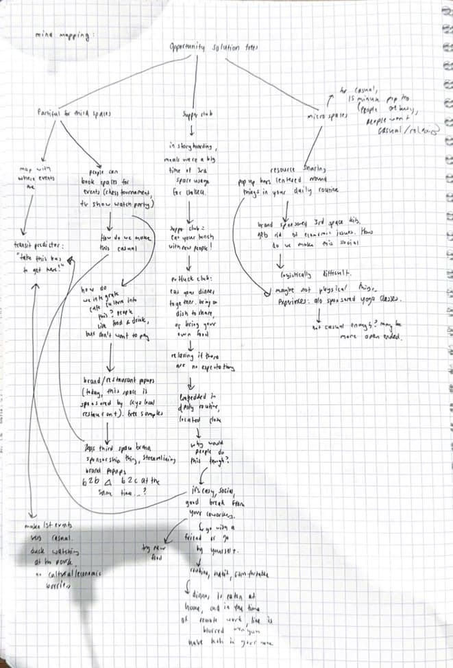
I chose mind mapping to draw ties between my ideas. The thread that kept coming back: food isn't an activity that happens on top of your daily routine.
Impact/effort matrix
Ideas with heavy brand coordination or economic logistics went in high effort.
High impact, low effort
Bring-your-own-meal club, supper club, a casual Partiful
High impact, high effort
A third space organization source for brands, a pop-up sample cafe system
Low impact, high effort
An automated third space coordinator, a BYO-drink customization bar
Low impact, low effort
A space booking site, a resource-sharing system
Third spaces don't need revitalization: Gen Z just needs a low point of entry. After weighing each concept on cost, social pressure, effort, and routine, I landed on a Bring Your Own Meal Club, a system that opens up community around eating. Meals are already part of everyone's day, food is a proven way into third spaces (cafes and free food came up again and again), and eating is relaxing and low-stakes.
It also doesn't depend on any one venue's culture, so it works as a general framework for any third space. It doesn't address the gym preference in my data, but it does capture the gym's appeal of parallel socialization: the ambient socialization that showed up throughout my research.
Bring your own food. No RSVP. Leave whenever. Chatting is optional. Find the supper club closest to you.
Mid-fi to hi-fi
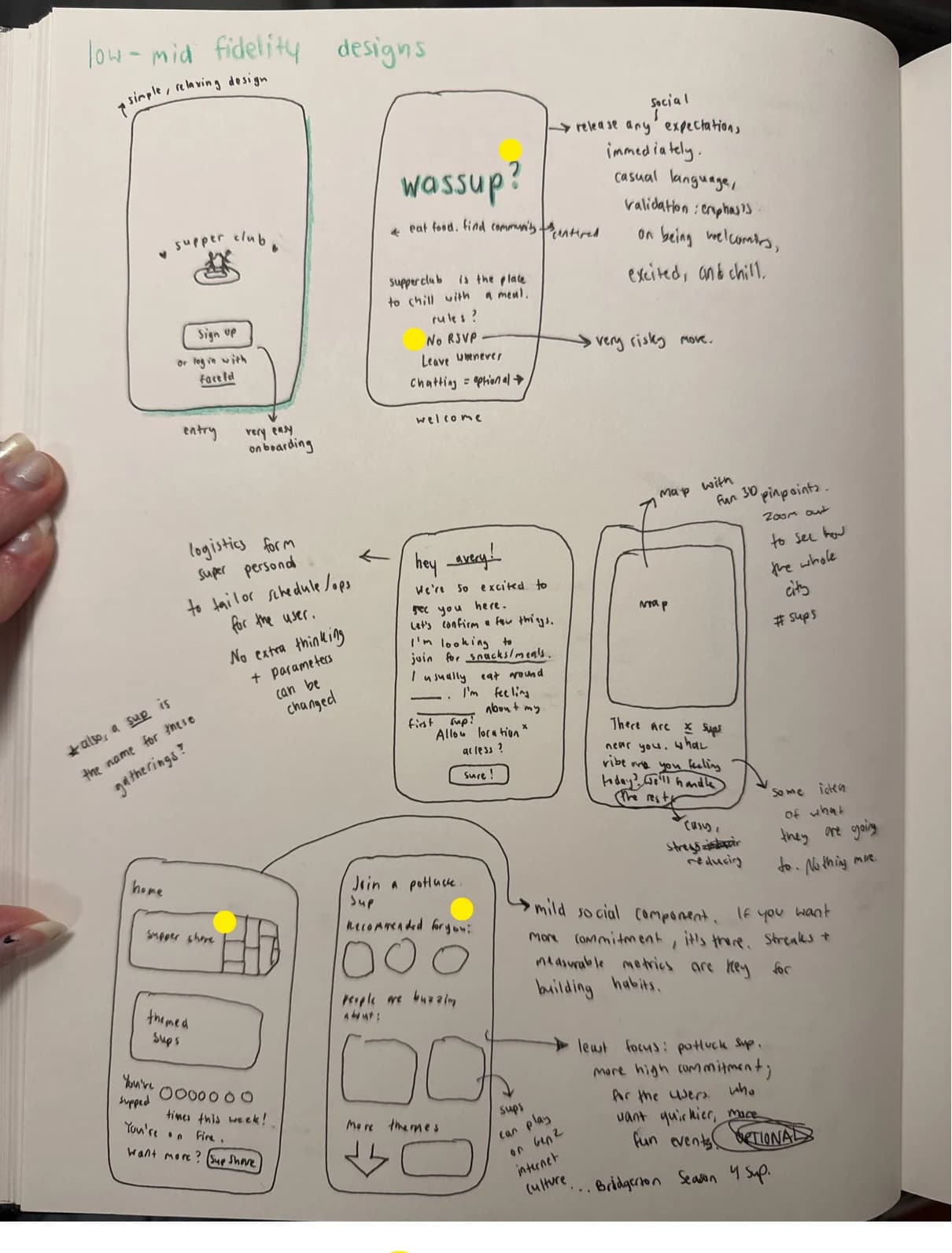
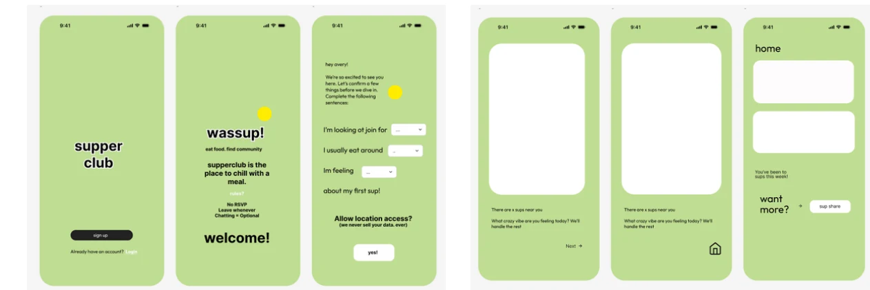
Yellow dots mark anywhere testers felt confused.
Mid-fi: layout, hierarchy, first buttons, and type. Yellow dots mark where testers felt confused.
Mid-fi decisions
- Descriptive language on the opening page to cue what the product does
- Personalization: the user's name is emphasized after sign-in
- Mad Libs–style dropdowns for planning, written as “I” statements so they feel easy and personal
- Transparency about data use to make people comfortable
- Vibe customization, so you know what you're walking into
- A metrics bar to show progress and build habits
- Simple, universal design, with slang aimed at the Gen Z users who are on their phones most
What testers said
- What is a 'sup?
- Confused by the potluck idea: do people have to pay or not? Don't ideate this yet.
- Is the name “wassup”?
- Are 'sups the people?
- The last page looks messy
- Still unsure what the app does Need to make a clearer welcome page.
Hi-fi prototype
A simple, universal entry point that's open to all of Gen Z.
Social rules set immediately, so there are no hidden expectations. Defining a 'sup answers testers' biggest question, and the quip speaks to Gen Z valuing a welcoming culture.
Personal, Mad Libs–style onboarding, plus a plain promise about location data.
A city-wide overview of 'sups shows it's a normal, everyday thing.
A personalized zoom-in based on your vibe. “Start navigation” opens your GPS app, so there's no friction in figuring out how to get there.
Streaks build the habit, and the comfort slider measures my key metric: is this actually lowering the social entry point?
Outcome
Relaxing and effortless, by design.
Supper Club answers the refined HMW by making showing up relaxing (no RSVP, chatting optional, leave whenever) and effortless (bring your own food, a nearby 'sup chosen by vibe, one tap to navigate). Nearly every part of the app traces back to the research, not to an idea I started with.
Reflection
Next time: test earlier, tighten the system, make it interactive.
Test earlier
Mid-fi feedback came late. Earlier testing would have caught mistakes before the hi-fi.
Tighten the visual system
Color, terminology, and the psychology behind them, so the interface feels as considered as the research.
Prototype the variants
The dropdowns are the heart of onboarding, but they aren't interactive yet.